From Raw Data to Confident Decisions
Markaaz Complete is a high-density enterprise data platform where compliance officers and risk analysts make high-stakes decisions every day — verifying vendors, monitoring portfolios, and assessing risk across thousands of global business records simultaneously.
My goal was to transform fragmented, inconsistent data into a clear, confident decision interface. Not by simplifying what's complex, but by designing an interface intelligent enough to surface the right signal at the right moment. Data visualization was the key to bridging what the data said and what the user needed to do next.

The Real Problem
The design challenge wasn't technical — it was cognitive. These users weren't struggling to find the data. They were struggling to act on it. My job was to transform a data display into a decision interface — something that didn't just show what was true but made the right action feel obvious.
Everything in this case study was designed around a single question: what does a user need to see the moment they land here to feel confident, not just informed? Those are different things. And the gap between them is where the design work lived.
A Decision Interface, Not a Data Display
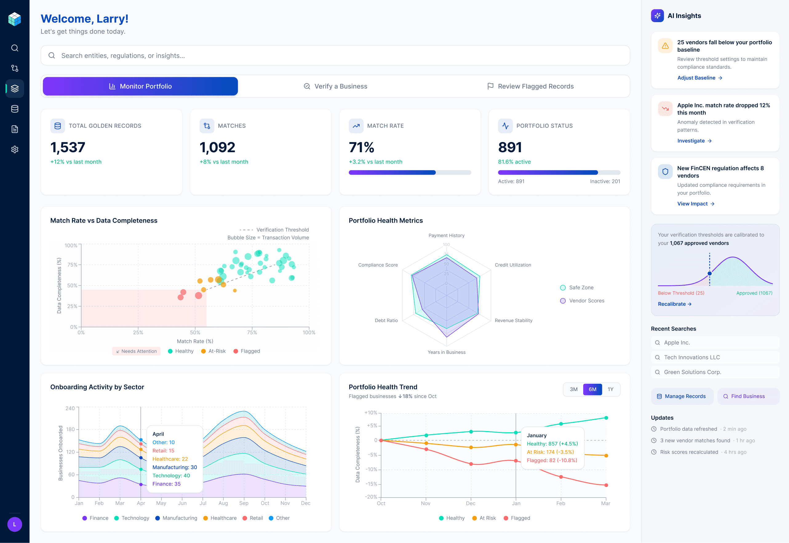
The dashboard was designed around one principle: the most important signal should reach the user before they have to look for it.
Match rate, total golden records, and matches sit above the fold because those three numbers answer the user's first question before they ask it — is my data working? Everything else supports that primary read without competing with it.
The visualization layer below was built to answer progressively deeper questions — each chart earning its place by serving a specific decision, not just displaying a dataset.
The scatter plot maps match rate against data completeness across the entire portfolio. Vendors clustering in the lower left quadrant are immediately visible as the ones needing attention — no numbers required.
The radar chart replaced two separate gauge charts that used inverse scoring logic — one metric needed to be high to be healthy, the other needed to be low. The inconsistency created unnecessary cognitive load for users assessing multiple vendors rapidly. A radar chart with a shared safe zone polygon eliminated the problem by making one visual convention do the work of two conflicting ones.
The stacked area stream graph shows onboarding activity by sector over twelve months — surfacing which industries are driving portfolio growth and when, so compliance teams can anticipate volume rather than react to it.
The portfolio health trend chart tracks the percentage change in healthy, at-risk, and flagged vendors over time. The indexed baseline makes all three categories directly comparable regardless of their different absolute counts — and the insight label surfaces the most important trend without requiring the user to interpret the chart.
Designing for Modes, Not Personas
The first instinct when designing enterprise software is to build around user roles. Compliance officer gets one view, portfolio manager gets another. It's clean, logical, and it's what every enterprise SaaS platform does.
I challenged that assumption with a behavioral insight: the same compliance officer verifying a vendor at 9am is monitoring their portfolio at 2pm and reviewing flagged records at 4pm. Designing around roles would have forced users to context-switch interfaces every time their task changed — which happens multiple times a day.
So I designed around modes instead. Three task-based entry points: Monitor Portfolio, Verify a Business, Review Flagged Records. The user tells the interface what they're doing and the interface reorganizes around their intent — not around their roles.
Search as a Decision Partner
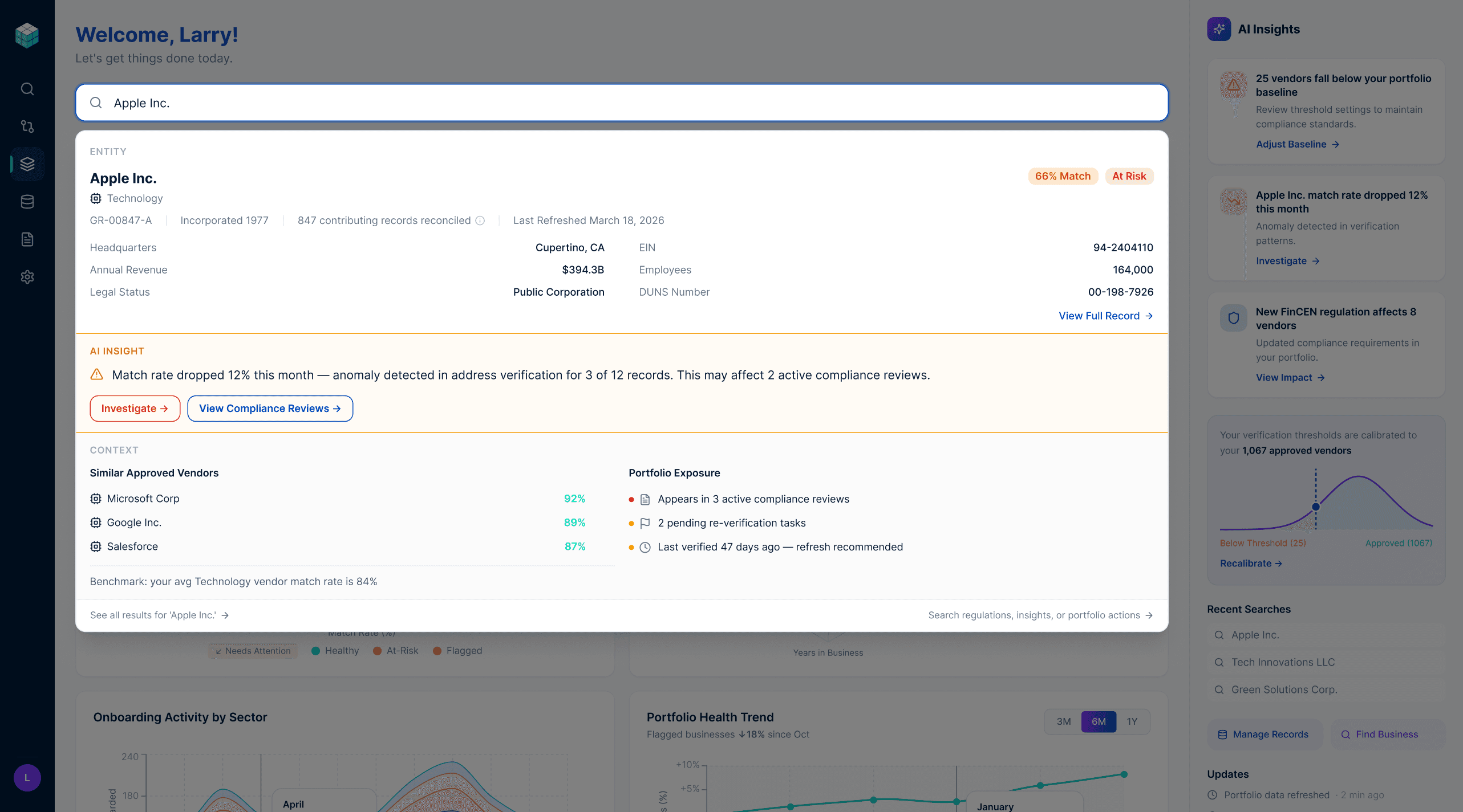
The global search bar does more than find records. It's a natural language interface to the entire platform — and the results it returns are designed around three layers of intelligence.
The first layer is the record itself: what you asked for, enriched with key identifiers and verification status. The second layer is the AI insight: what you need to know right now, surfaced proactively without being asked. A 12% match rate drop detected in Apple Inc.'s address verification, affecting 2 active compliance reviews, with a direct path to investigate — delivered the moment the search resolves. The third layer is context: similar approved vendors for benchmarking, portfolio exposure showing where this vendor appears across active workflows, and data freshness indicators.
The design principle here is the distinction between reactive search and contextual intelligence. A database returns what you asked for. A decision partner tells you what matters. The search overlay was designed to be the latter — anticipating the user's next question, not just answering their current one.
AI Insights: From Notification to Action
The AI Insights panel on the right side of the dashboard is always visible regardless of which mode the user is in. That placement was deliberate — intelligence shouldn't be tucked away in a menu. It should be present at the moment a decision is being made.
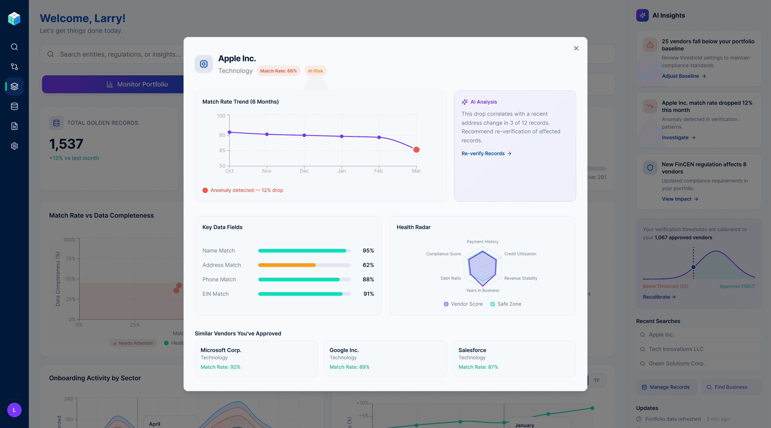
Each insight card follows a consistent structure: observation, context, action. "Apple Inc.'s match rate dropped 12% this month" — that's the observation. "Anomaly detected in verification patterns" — that's the context. "Investigate →" — that's the action. The user never has to figure out what to do with an insight. The interface tells them.
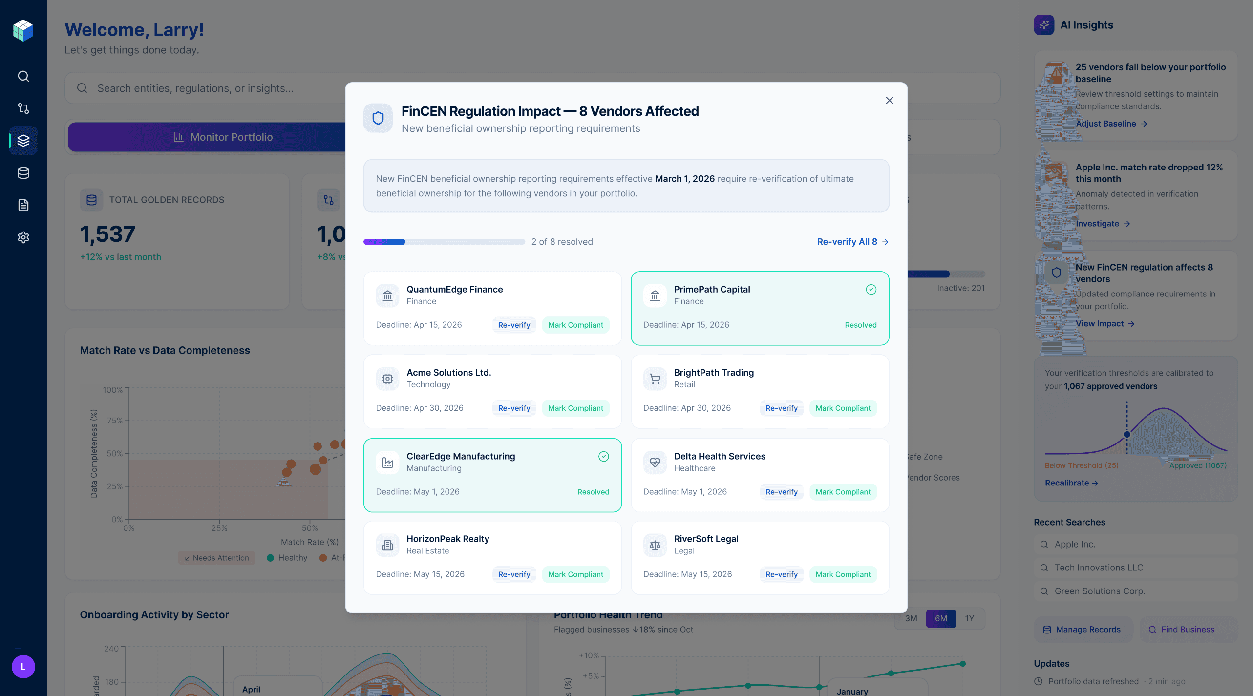
The third insight card demonstrates the most sophisticated layer of this thinking — "New FinCEN regulation affects 8 vendors in your portfolio." This isn't a search result. The user didn't ask about FinCEN regulations. The platform cross-referenced a regulatory change against the user's specific portfolio, quantified the exposure, and surfaced it proactively. Clicking through opens a full impact view showing each affected vendor, the required action, the deadline, and a progress indicator tracking how many have been resolved. The regulation is explained in plain language. Every vendor has a path to resolution. The user never has to leave the platform to understand their compliance exposure.
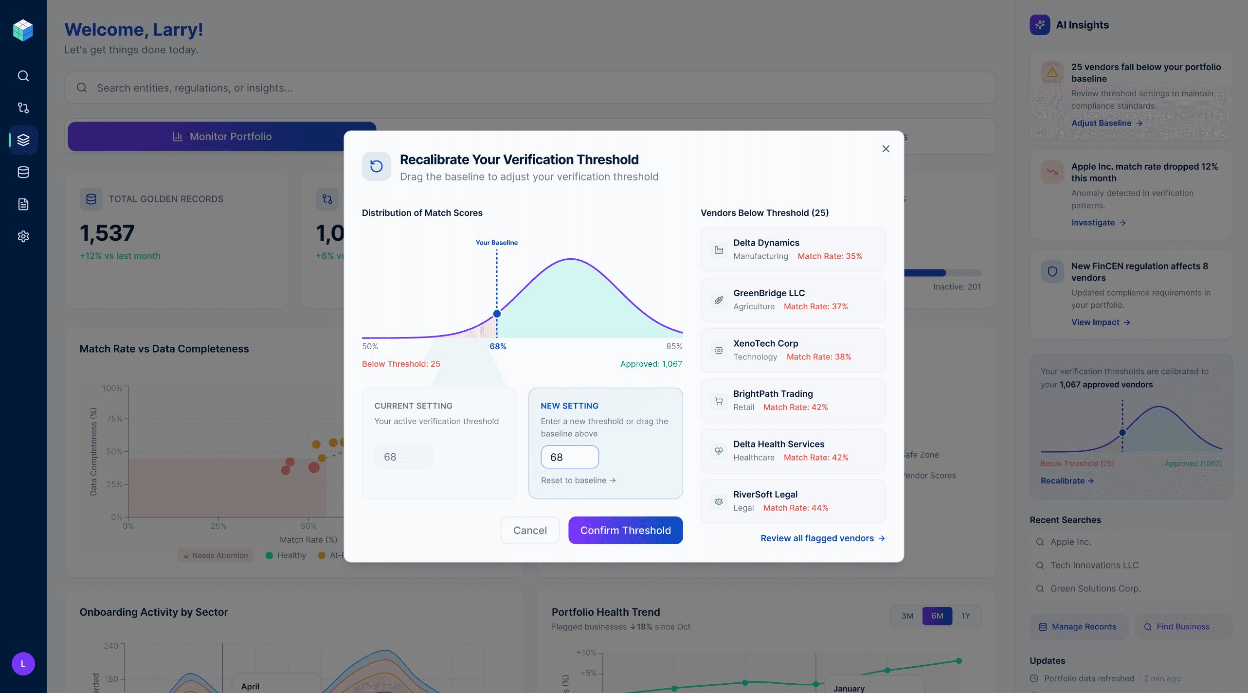
The Threshold Decision
The original threshold configuration asked users to input a match score cutoff for vendor verification. The default was set to 70. Users could change it. The problem was that 70 meant nothing. Users had no reference point for whether 70 was strict, lenient, or appropriate for their specific portfolio. They were being asked to make a consequential compliance decision with no context.
I proposed a different approach: analyze each enterprise's existing approved vendor portfolio and set the threshold relative to that baseline. Instead of "set your threshold to 70," the system says "based on your 1,067 approved vendors, your threshold is calibrated to 68." The number is now meaningful — it's derived from decisions the user has already made and implicitly validated.
The recalibration modal makes this story visible. The bell curve shows the distribution of match scores across the approved vendor portfolio. The draggable threshold line shows exactly where the cut falls and how many vendors sit on each side. The current setting and the new setting sit side by side — the user sees the impact of any change before they confirm it. The vendor list on the right shows exactly which businesses fall below threshold, so the decision never feels abstract.
This reframed threshold-setting from a configuration task into a calibration conversation — one grounded in the user's own data, not an arbitrary number someone set in a backend system.
Key Takeaway
Designing Markaaz Complete reinforced something I believe deeply: the gap between data and decision is a design problem. The data was always there. The question was whether the interface could surface the right signal at the right moment in a form that made action feel obvious rather than effortful.
Every decision in this product — the task-based navigation, the visualization hierarchy, the AI insight structure, the threshold calibration — was made in service of that gap. But I'd be doing myself a disservice if I didn't acknowledge the other truth: beautiful design matters too. Craft, visual precision, and aesthetic intention aren't in tension with usability, they're what make a complex interface feel trustworthy rather than intimidating. When data looks considered, users trust it more. When an interface is visually confident, users feel confident using it.