Visualizing the Halo Effect
How do you show a marketer revenue they didn't know they were generating?
A design exercise for Northbeam's Incrementality product — exploring how to communicate the causal mechanism behind incremental revenue, not just the numbers. Three concept directions, one polished interactive module, designed to scale across every possible test outcome.

Challenge
Northbeam's incrementality tests reveal hidden revenue — what they call the halo effect. In this case, a 56-day Meta advertising holdout test found that 56% of incremental lift came from Direct to Consumer revenue and 44% came from retail channels like Amazon. The 44% is the halo — revenue that Meta spend caused in channels the client had no visibility into before the test.
The design challenge: communicate not just the what ($200K, 56/44 split) but the why — the causal mechanism that connects ad spend to unexpected revenue. And design it to scale gracefully when the test shows partial results or no lift at all.
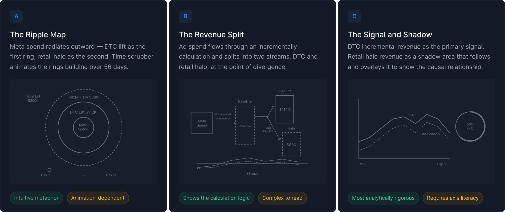
Concept Exploration
I explored three distinct directions before selecting one for development.
The Ripple Map treated the halo as a metaphor — ad spend radiating outward like a stone dropped in water, with DTC lift as the first ring and retail halo as the second. Intuitive and immediately legible, but animation-dependent and potentially too consumer for a B2B analytics platform.
The Revenue Split took a logic-first approach — showing ad spend flowing through the incrementality calculation and splitting at the point of divergence into two streams: DTC lift above, retail halo below. Analytically honest and shows the calculation, not just the result. The weakness is cognitive load — it requires the user to follow the flow before they reach the insight.
The Signal and Shadow was the most analytically rigorous — DTC incremental revenue as the primary signal, retail halo revenue as a shadow area overlapping it over 56 days. The halo literally follows the DTC signal, encoding the causal relationship temporally. This was the direction I selected for development, combined with the ripple metaphor as a hero visual.
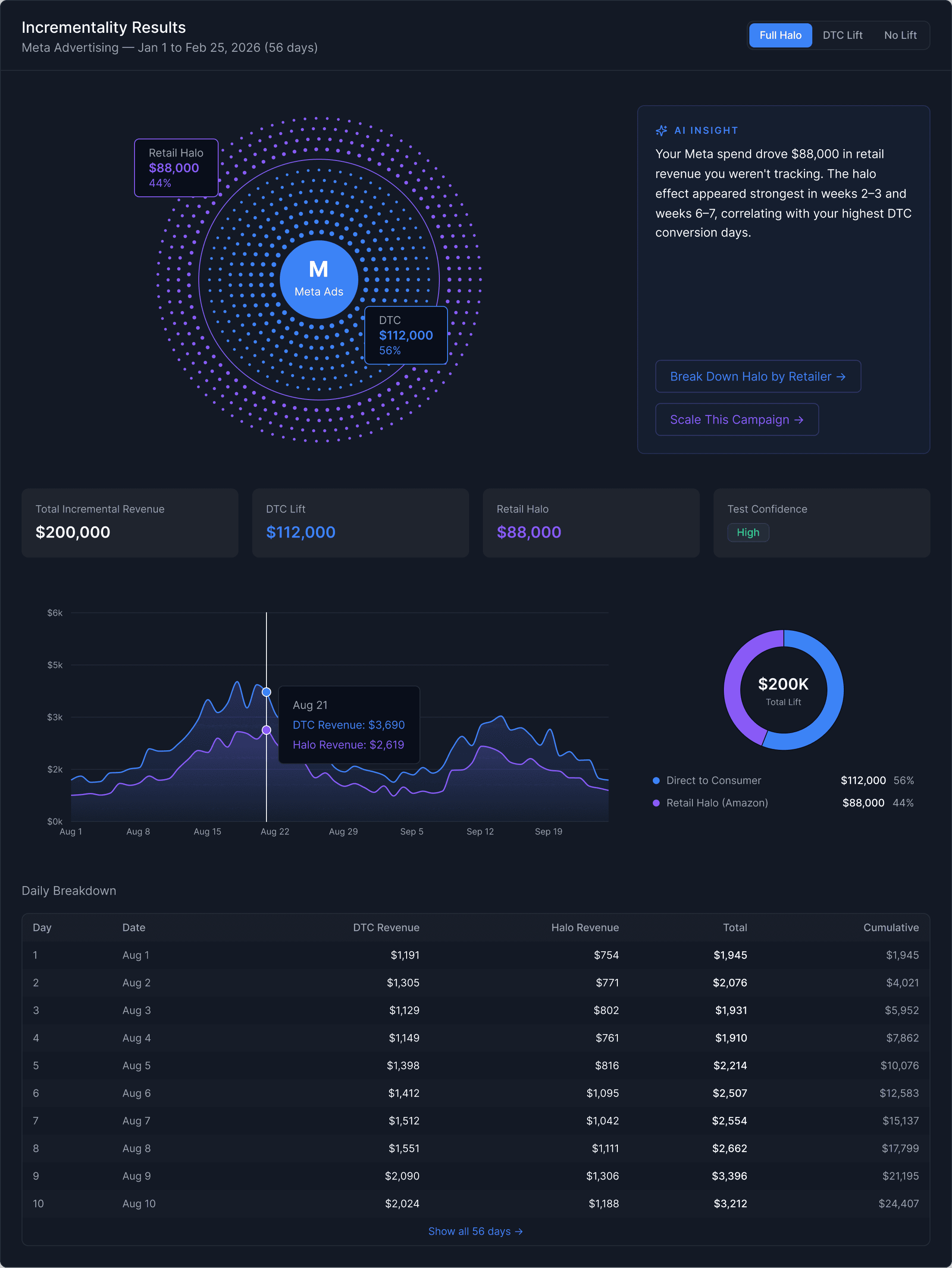
Polished Module
The final module answers three questions a marketer brings to this screen — what happened, how much, and how it built over time — through three distinct layers.
The halftone dot field at the top is the emotional read. Blue dots represent DTC revenue, violet dots represent the retail halo. The color boundary is set at exactly 56% of the field radius — mathematically encoding the 56/44 split directly into the visualization geometry. A radial pulse wave travels outward from the Meta center every four seconds, showing causation: spend radiates outward and creates revenue in two channels simultaneously.
The KPI row below confirms the aggregate numbers. The overlapping area chart shows both revenue streams across the full 56 days — the violet halo area following and mirroring the DTC signal, slightly smaller and more transparent, making the causal relationship visible temporally. The daily breakdown table gives granular data for anyone who needs to verify the numbers row by row.
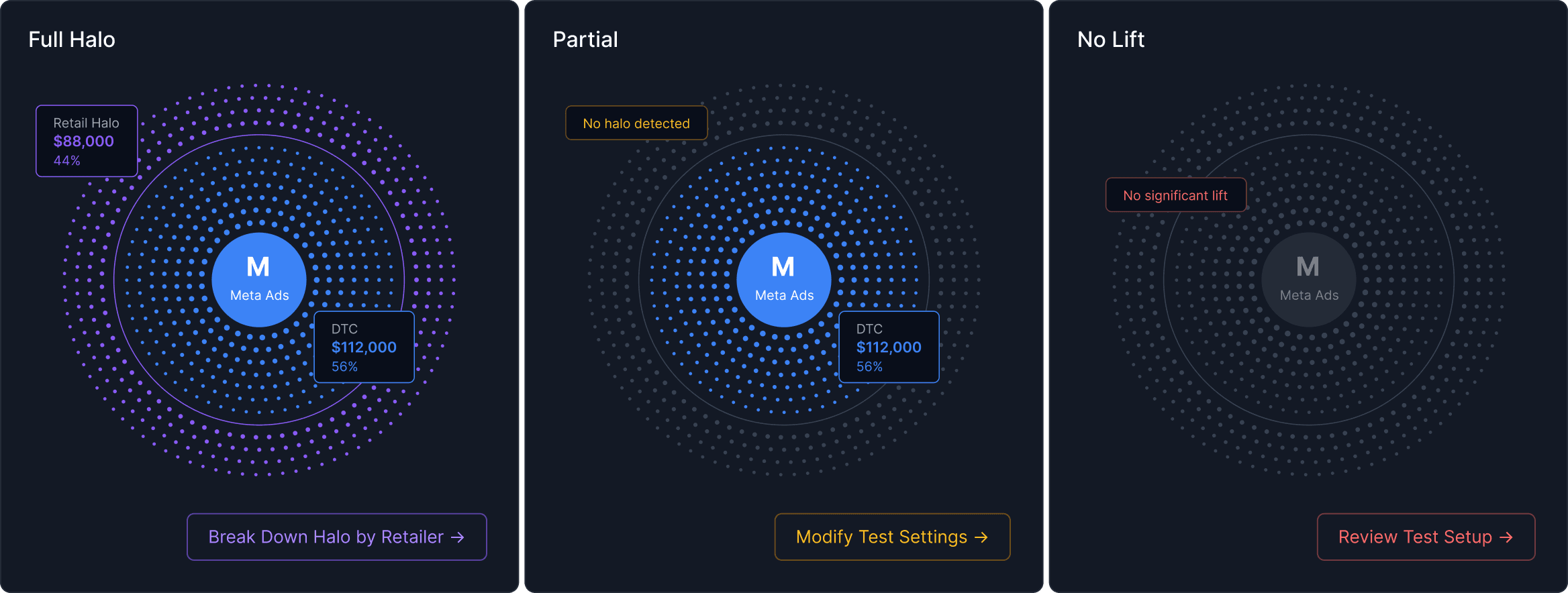
Designing for Uncertainty
The design is to scale when tests come back less conclusive:
Full Halo — both revenue streams visible, full dot field animation, both CTAs forward-looking (Break Down Halo by Retailer, Scale This Campaign)
Partial — violet dots fade to near-invisible, pulse wave stops at the DTC boundary, AI insight recommends extending the test duration or increasing holdout percentage
No Lift — entire field drops to near-invisible gray, chart collapses to flat line, AI insight diagnoses potential causes and recommends next steps
Every result state has a recommended next action. The module never leaves the user without a path forward.
Key Takeaway
This exercise reinforced something I believe deeply: the job of data visualization isn't to display information accurately. It's to make the right information feel undeniable. The halo effect is a powerful insight — but only if the person looking at the results can feel the mechanism, not just read the numbers.
That's what the dot radiation, the overlapping area chart, and the AI insight layer are doing together. Not showing data. Making causality visible.


